
Sometimes it can feel like you’re getting lost because the wrong parts were put in the right places. We specialize in stripping down the chaos, organizing your information for peak efficiency, and rebuilding your site to perform better and drive results.
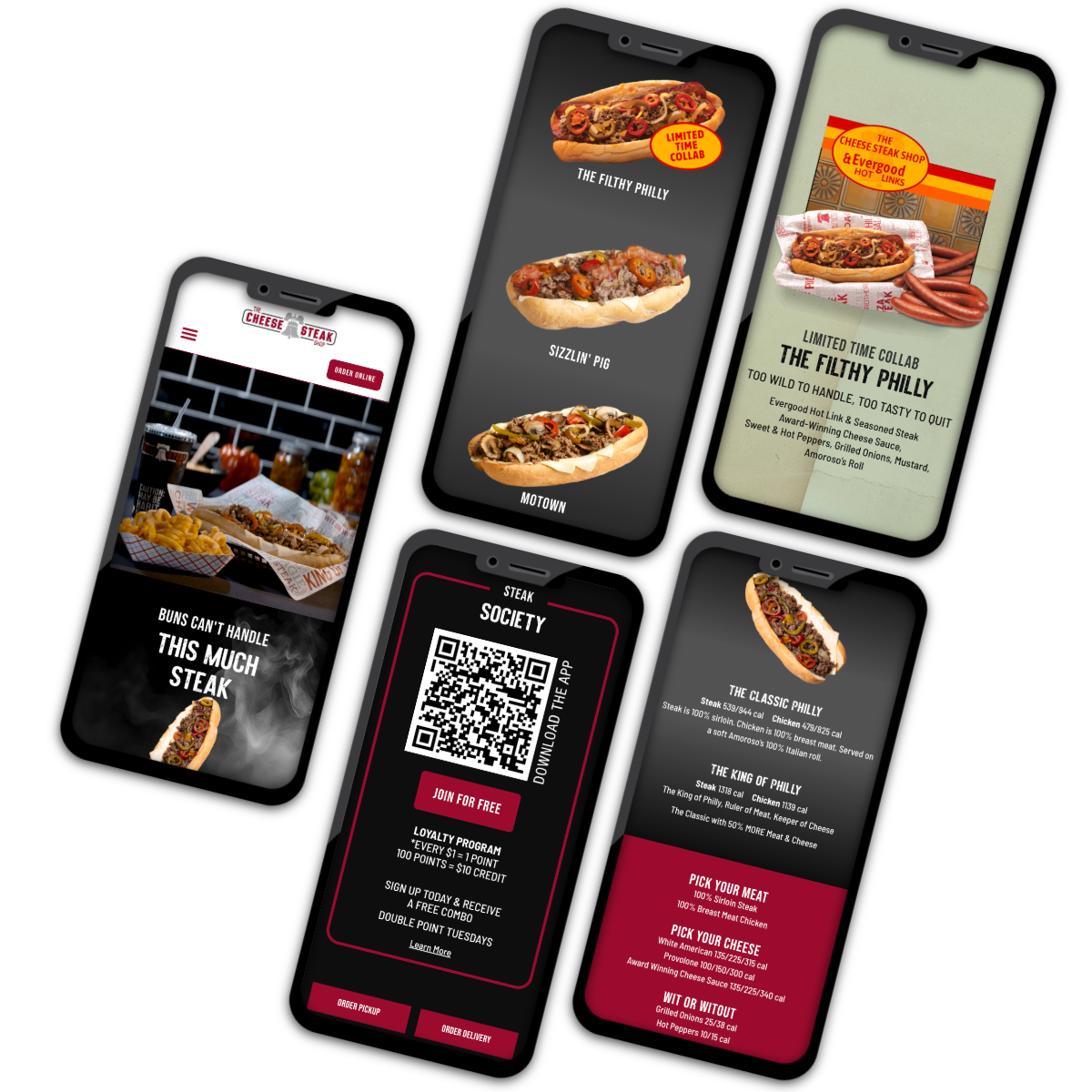
With a complex business model involving multiple locations, layers, and options, The Cheese Steak Shop’s personality had lost its shine. We brought it back, full throttle. Now, the Cheese Steak Shop amplifies Bold, and their branding leans on pillars rooted in “Authentic Philly” both in mindset and practice.
On the other side of things, customers shouldn’t have to go through an obstacle course to get to the product. We updated their old UX/UI flow that was stopping people before they could step on the gas. Not only did this get online Cheesesteak sales racing, but we also ensured everyone can ride, with special attention to ADA compliance and accessibility.
The streamlined site, revived Philly attitude, and our brand-new content, which was curated from the ground up, created the perfect place to send people for all things Cheese Steak Shop, whether they want to order a Filthy Philly or open a store of their own.
The site has garnered attention and awe, doubling in users from 2024 and bringing in engagement across the site.
With an update needed, stat, we set to work on a full-scale modernization with new tech, updates to both the hood and trunk of the site, and made moves for a mobile-friendly design so the trains could keep running for another century.
Assembling their countless events and options in a common-sense format, we championed what matters: ticket sales. In the end, we built a forward-facing site that became the backbone of their promotional materials for the next 7 years, while generating a 96% ADA compliance rating. Our tune-up also meant that even with increased, heavy traffic, Roaring Camp Railroads can continue full steam ahead.
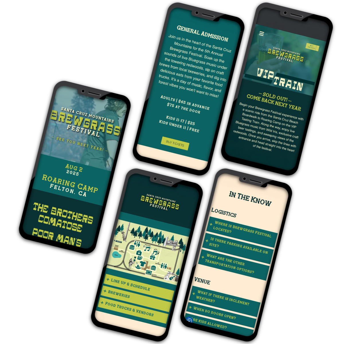
It’s a classic underdog tale – Brewgrass, Roaring Camp’s annual festival, celebrating both Bluegrass music and beer, had ticket sales that were stuck in the mud. In 2025, after feeling like customers were getting lost, Roaring Camp decided to give it one more shot.
We saw the potential for what a fresh coat of paint could do. We adjusted the architecture, pulling Brewgrass out of the Roaring Camp site to give it its own website and branding. We made sure to give a nod to Roaring Camp’s historic style, but left room to breathe some air into the brand.
What transpired next was our version of the Rocky montage:
We’ll save the dramatics and leave you with the results: a groovy new website, a festival that quadrupled ticket sales from 2024, and a list of bands begging to be a part of the fun in 2026.
Roaring Camp Railroads, which offers its stunning grounds as a wedding venue, felt that its event efforts were being missed on their main site.
We revamped “Roaring Camp Weddings” into “Roaring Camp Trackside Ties,” giving this piece of Roaring Camp a new, sophisticated spin, with a website to match.
A fresh color palette inspired by the natural beauty of Roaring Camp’s surroundings and a design that bridges the historic, rustic feel with the refined elegance of a wedding venue ensured Trackside Ties was both rooted in tradition and inviting for modern couples.
The website followed suit. With an elegant flow, we prioritized what matters to couples: pricing, the ceremony spots, and potential packages, while every click led them closer to their dream wedding.
This website isn’t just for those gettin’ hitched. We ensured the information could be easily used and updated by their team, and even developed separate, secret pages with more information for the team to share with leads. Talk about something to celebrate!
For their 50th Anniversary, Delavega golf course was hoping not to look their age. We stepped in with a website facelift, tightening by focusing on the details.
We shifted the site from an array of details and data to prioritizing Tee Times and an effortless flow. We trimmed the clunk and made it mobile-friendly. And while golf may be their bread and butter, we wanted to highlight their other moneymakers, too. Even their hiking trails got a reorganization, with an interactive map complete with historic landmarks and iconic Deleveaga hotspots (and in case you were wondering, yes, we mapped out the trails in person – Louis and Clark-style). The key was using organization to let the details stand out and complement each other in a way that says, “Hey, you’re already up here hiking, why not join us for happy hour!”
Accompanied by a modern logo refresh and updated branding colors, they’ll be aging gracefully for years to come.
Dorothy’s Place’s website was an aggregation of information from various places and personalities. While well-intended, the lack of connection was impacting donations and the clients who use their services.
So, how do you steer a packed van filled with people heading to different destinations?
First, we went back to the mission. What drives them? And how can it be embodied throughout the site?
Second, we recognized the different audiences who use the site: clients, volunteers, and donors alike, and made sure to give each of their needs a home.
Third, everything had a purpose. We championed the donations page in the navigation, prioritized accessibility, both in assuring ADA excellence and inclusive copywriting, and we gave them a unique color palette that supported their new compassionate, engaging tone.
With a little love and attention to the destination, we took Dorothy’s Place from a lot of information to informational.
Strategy that’s smart, packs a punch, and built for results? She’s on it. With a background in branding and strategy, she’s got the investigative edge to dig up the gold – the parts of your brand that make audiences sing your name and actually respond. She’ll spot the insight that pushes the edges and carries the campaign to new heights. She applies that same strategic sharpness to media, building strong rep relationships, so your campaigns don’t just drift, they bring home the loot. She’s the kind who shows up at the drop of a hat – calm, prepared, and somehow already three steps ahead because she’s been listening. If you were stranded on an island, you’d want Sophia there, too.